
Freeman Estate
“We Don’t Just Build Big, We Build Big Dreams”
Role: UI/UX Design, Developer
Year: 2022
Timeline: 8 weeks
Tools Used: Figma, Photoshop, GIMP
Background
A client offered an opportunity to redesign and modernize their current website. The website highlights pre-construction development in St. Lucia, which includes a variety of luxury homes, townhomes, and condos.
Problem
According to Travel Weekly, the cost of an all-inclusive trip to Caribbean countries has doubled over the past year. Because of this, the desire to own real estate in the Caribbean has risen. As a result, Statista predicts that the real estate market expects to grow at an annual rate of 4.49%, “resulting in a market volume of US$2.69tn by 2029.” While real estate is still relatively cheaper than in urban parts of Canada and the USA, the time to invest in these properties is now.
Solution
Build a responsive website for a new pre-construction development in St. Lucia. The goal was to highlight the property’s elegance and comfort while modernizing the website’s appearance to increase traffic, inquiries, and investment.
Research
I first started evaluating the live website to search for areas of improvement.
The client and I determined that the placement of some elements was poorly formatted and positioned. The lack of uniformity made the website difficult to navigate, read and scroll through.

The client and I also determined the website was too word-heavy. Although many of these descriptions helped understand the offerings, there were opportunities to refine these paragraphs to deliver this information succinctly. As a result, this abstracted from the website’s attempt to convey its luxury and elegance.
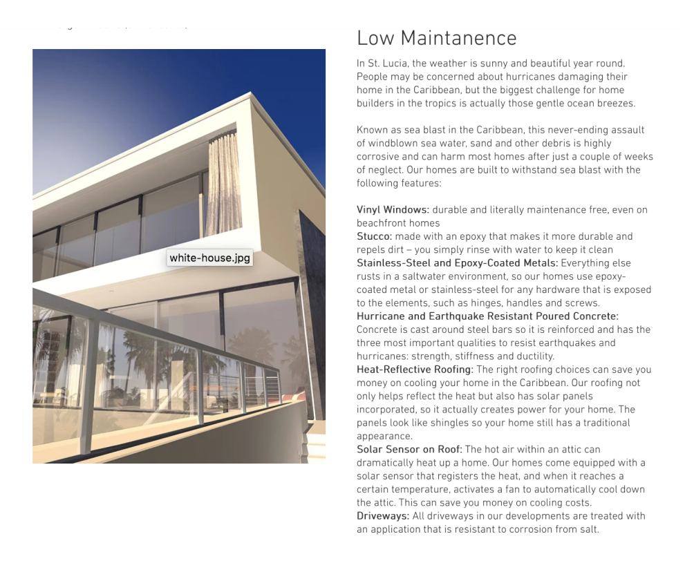
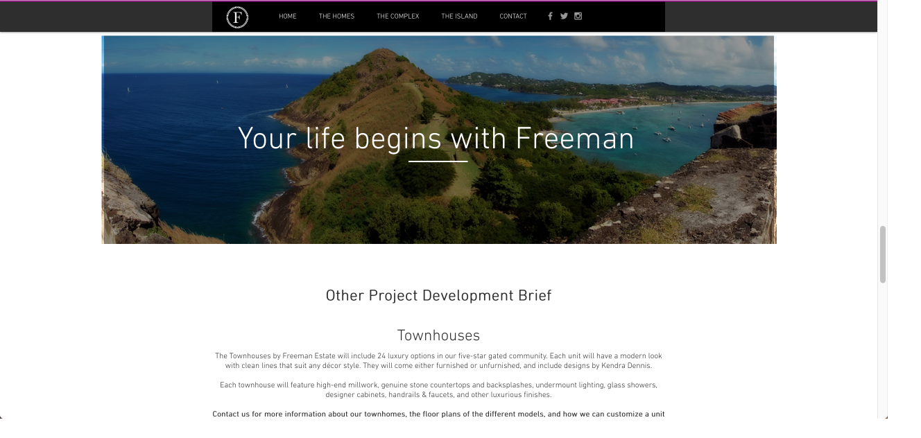
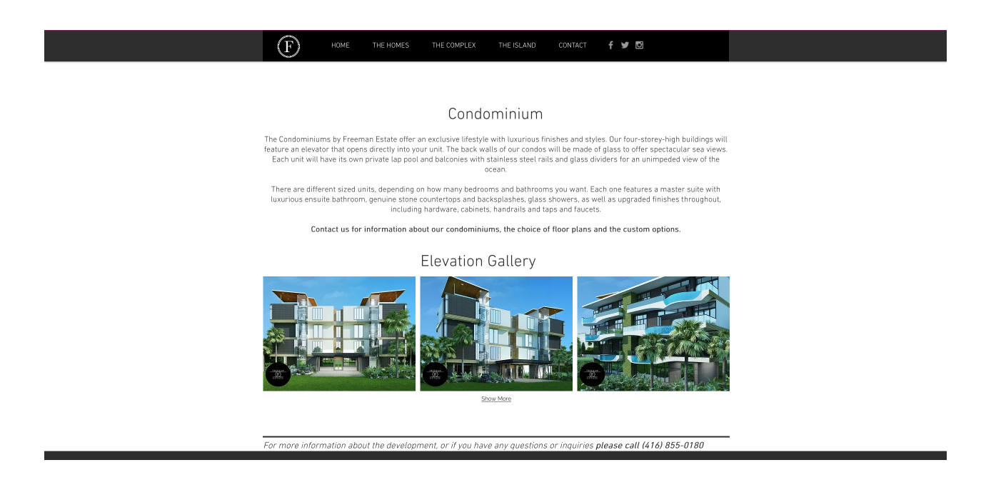
Lastly, the client and I agreed that the website’s design was outdated. The fonts selected were dull, and many banners and photos were either irrelevant to the content or disordered.
Ideation
I have created a user persona to strictly define the model client.

When it came to the website’s design, the goal was not only to resolve its lack of uniformity but to simplify the entirety of the design. In summary, we wanted the high-resolution photos to be the highlight. The client and I edited its text to make it more concise. I separated these photos and created a sitemap that organized them in the correct positions.

Design
With the structure of the website solved, I was able to roughly sketch pages in correlation with the sitemap.
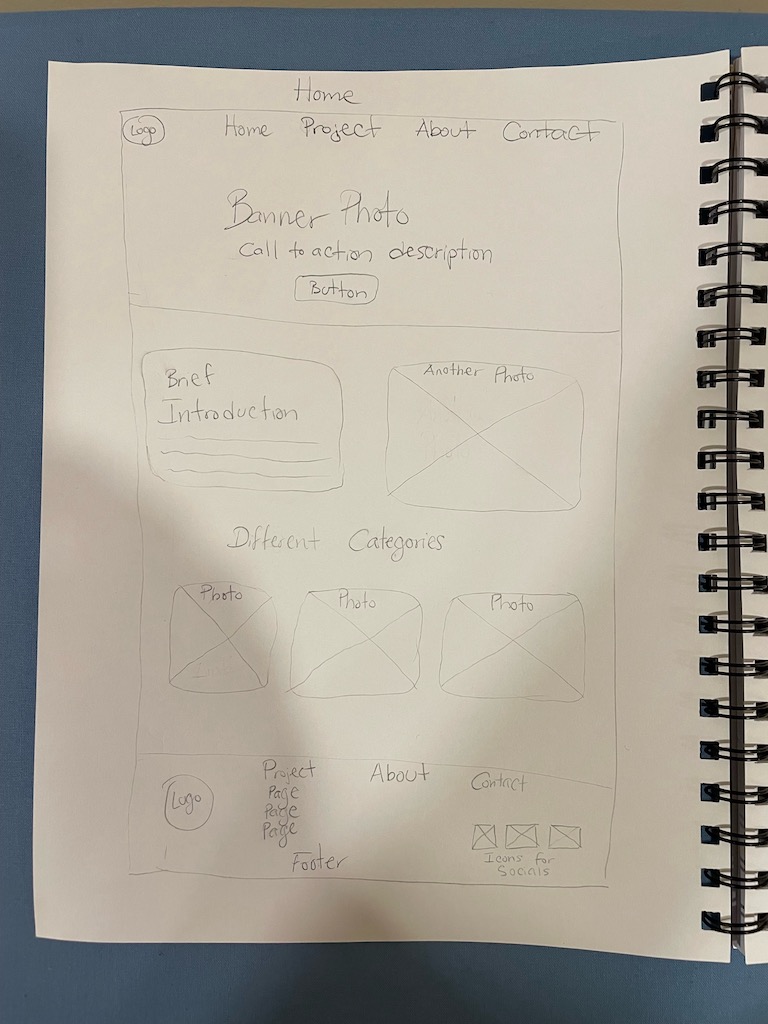
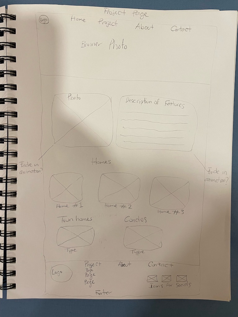
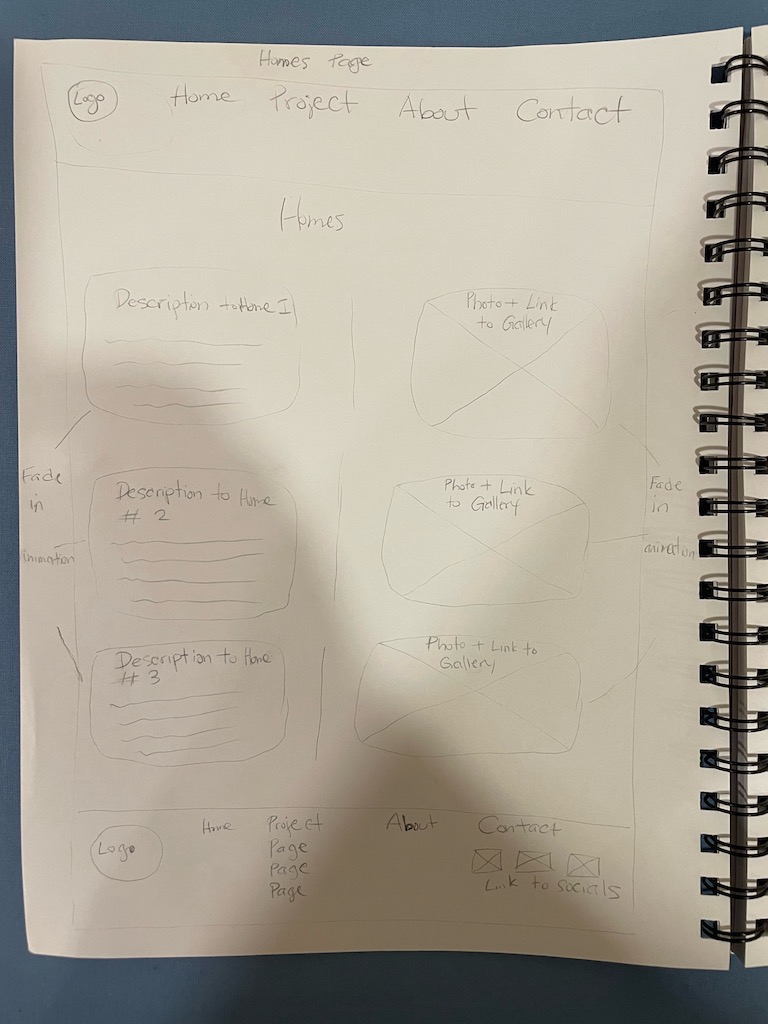
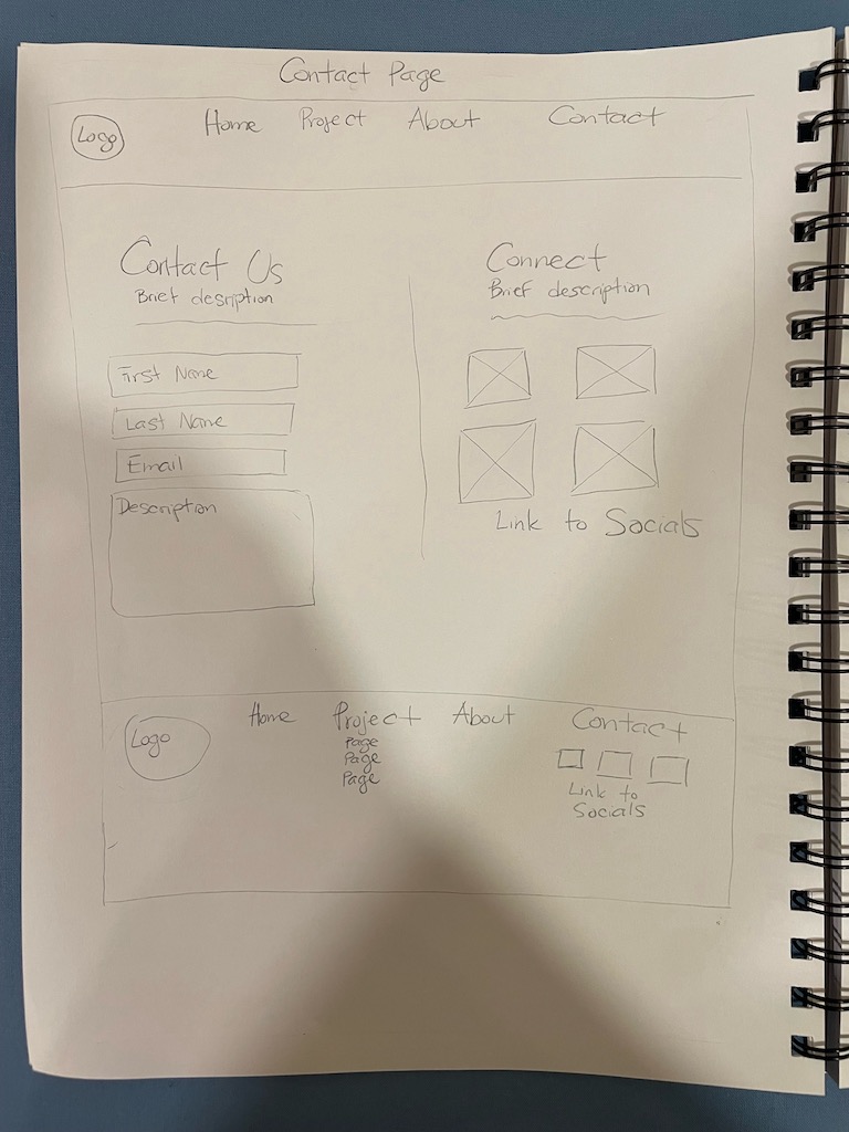
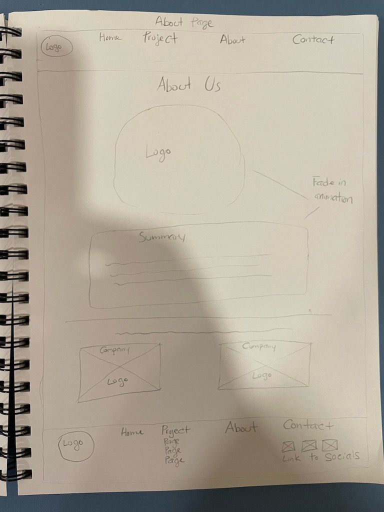
At this stage, the client requested an additional page be made under the ‘About’ section named ‘St. Lucia’. This page would be dedicated to the history, culture, and current events of St. Lucia. I implemented this request along with the dedicated photos to create a hi-fi wireframe.


Testing
The client had several notes to add from the original prototype:
Feedback: Include only one logo for the website’s banner
Fix: Included the same logo as the banner
Feedback: The images needed to be much larger to make the website feel more grand
Fix: We made most of the images the entire width of the screen
Feedback: The text did not accent the product’s ‘luxury’
Fix: Changed the heading and body fonts that were complimentary of the website
Feedback: The client preferred additional colour added to the background of the website to make it feel less empty
Fix: I included a wallpaper of a faded aerial view of St. Lucia in the background of each page
Feedback: Highlighting the culture of St. Lucia is paramount to this project.
Fix: Included links to St Lucia’s Tourism and Authority website to intrigue desired visitors
Feedback: Would prefer more ‘call to action’ buttons
Fix: Included a button at the bottom of each page to contact the client about offerings
Feedback: Would like the website to be less ‘static’
Fix: Included additional animations and videos that fit the design of the website
Due to the time constraints, I decided to bypass editing the prototype and chose to implement the design.
To view the full website, click the button below.
Branding
With the logo and photos already created, I wanted to incorporate text and colour that produced an elegant, clean, and captivating design.
Logos

Colour

Fonts
Great Vibes – Bold
Great Vibes – Regular
Montserrat – Regular
Montserrat – Regular
Buttons

Conclusion
Considering this was the second professional website I’ve created, there were a lot of lessons learned that made this process invaluable. There are things that I would have done differently:
- Create more than one prototype to choose from
- Research the CMS before the design
- Ensure that all media is held by myself before creating a prototype
All in all, I was very proud of the work that was done to complete this, and the client was satisfied with the website.